
Customizing the Withdrawal Widget and Form
Everything your customers read and see - the footer line, the button, every label on the form, the confirmation screen - is yours to edit. You'll find it all on the Customize menu of the EU Withdrawal Button app, with a live preview beside it.
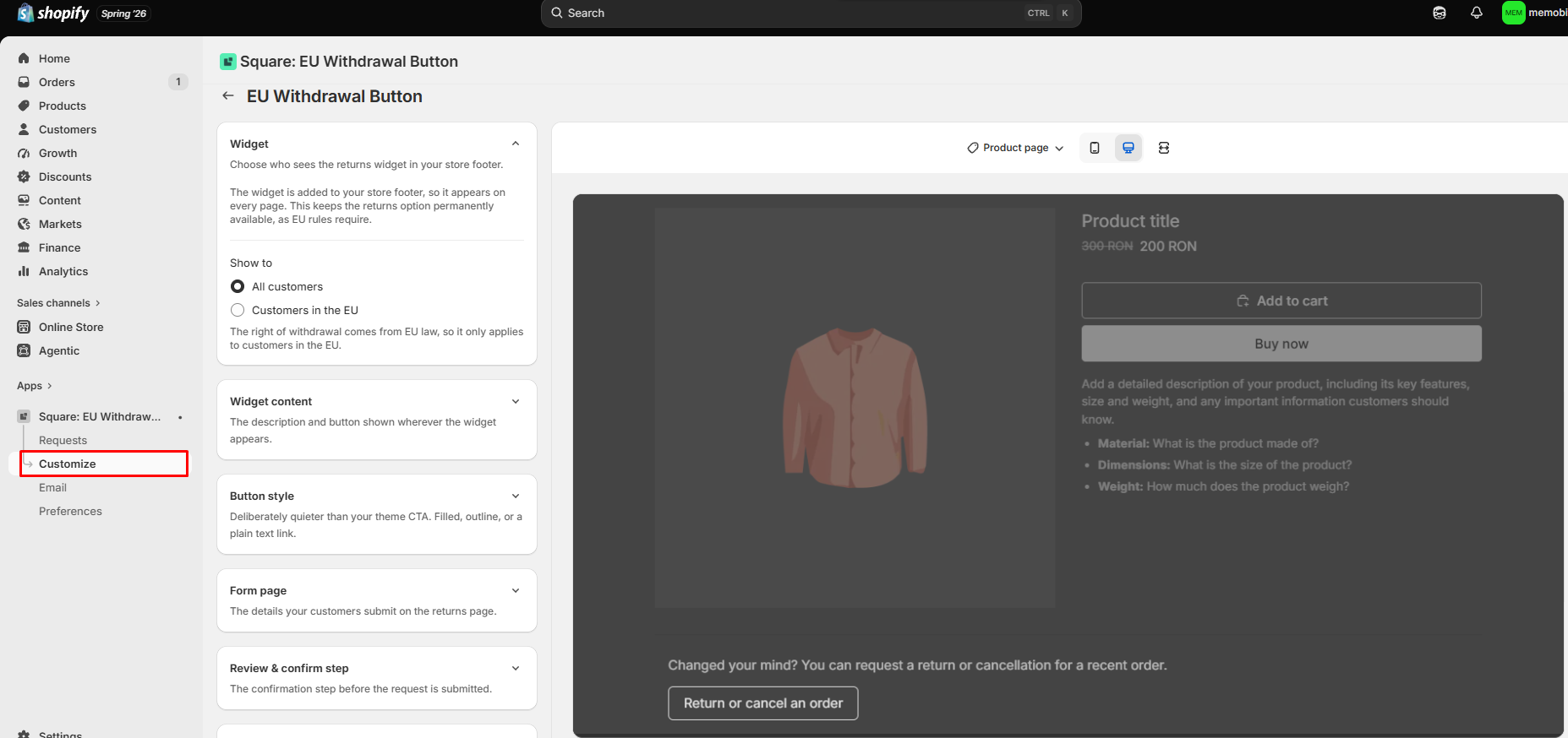
How the Customize tab is organized
The settings are grouped into seven sections:
| Section | What's in it |
|---|---|
| Widget | The "Show to" setting — whether the widget is shown to all customers or only to customers in the EU. |
| Widget content | The description line and button text shown in your footer, plus their colour and size. |
| Button style | Filled, Outline, or Text only, with colours, border radius, font size, and a full-width option. |
| Form page | The "Ask for customer name" toggle, every label and placeholder on step one, the refund policy line, and the form's colours. |
| Review & confirm step | The title, description, and submit button on step two. |
| Success page | The title and confirmation line customers see after submitting. |
| Translations | A link to the translations page for this app, where you translate every text into your store's other languages. |
Using the preview
The preview on the right shows the surface you're currently editing. You can switch between Product page, Returns page, Review & confirm, Order not matched, and Success page, and toggle between desktop and mobile.
It also switches on its own: change a form label and the preview jumps to the form, open the Success page section and the preview follows. The preview uses sample order details — a sample order number, customer name, and email — so you can judge the layout without placing a test order.
💡The preview draws the widget on a mock product page so you can see it in context. On your live store the widget sits in the footer, which appears on every page.
Choosing a button style
Three options: Filled, Outline, and Text only. The default is Outline.
That default is on purpose. This button is a legal function, not a sales button. If it looks exactly like your Add to Cart, it competes with it. Outline keeps it clearly visible without pulling attention away from your main call to action. There's no "match theme button style" option for the same reason.
What you can change depends on the style you pick:
- Filled — background colour, text colour, border radius, full width
- Outline — text colour, border colour, border radius, full width
- Text only — link colour, and whether the link is underlined
Font size and the widget's top and bottom spacing apply to all three.
Editing the text your customers read
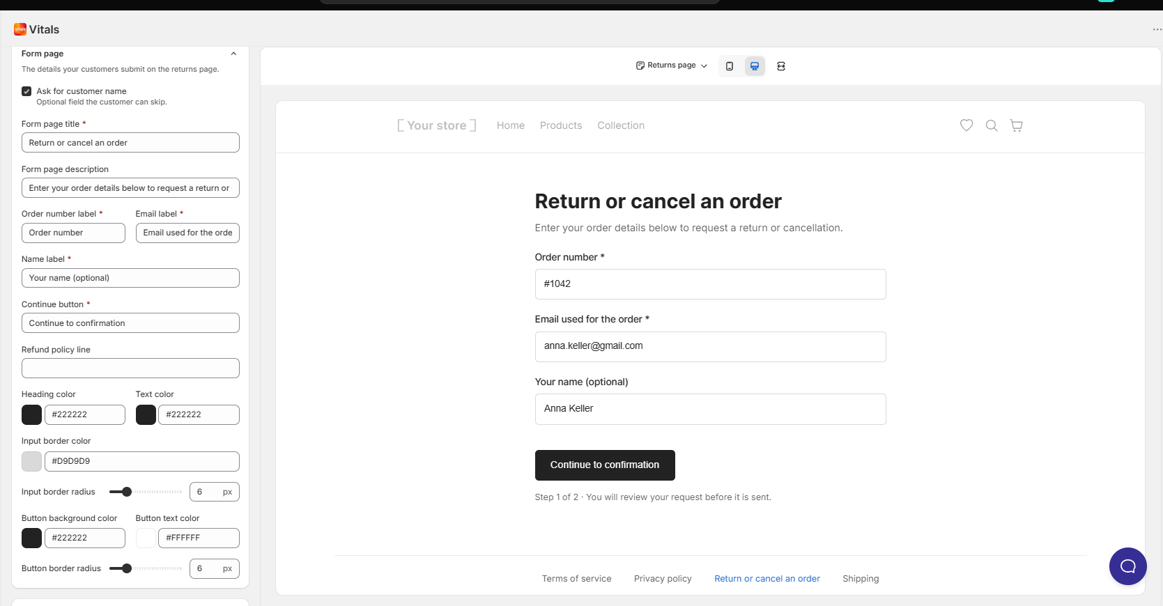
Every line is a plain text field. The defaults are written to sound natural to a shopper rather than legalistic:
- Footer description: "Changed your mind? You can request a return or cancellation for a recent order."
- Footer button: "Return or cancel an order"
- Form title: "Return or cancel an order"
- Step two button: "Submit request"
- Success title: "Your request has been received"
You can rewrite any of them. If you do, keep the wording unambiguous. A shopper should be able to tell at a glance that this is how they cancel or return an order.
Texts that use variables
Some texts include placeholders that the app fills in with the real values: {{ order_number }} and {{ email }} . The "order not matched" message and the review step hint both use them. Reword freely around a placeholder, but keep the placeholder itself intact, including the spaces inside the braces, or your customers will see the raw text instead of their order number.
The refund policy line
Step one of the form ends with a line pointing to your refund policy, linked to your store's /policies/refund-policy page. You can reword the line, and clearing it removes the link entirely. The address it points to isn't editable, so make sure that policy page exists on your store.
Translating the form
Every text on the widget, the form, and the confirmation screen is translatable. Open the Translations section and follow the link to the translations page for this app, then add your wording for each language your store sells in. Customers see the form in the language they're browsing in.
Frequently Asked Questions
Can I change the text on the footer button?
Yes. Open Customize → Widget content and edit the widget button text. The default is "Return or cancel an order".
Can I make the button match my theme's Add to Cart button?
There's deliberately no option to copy your theme's button style — this button shouldn't look like a primary call to action. You can still set the colours, radius, and size by hand under Button style if you want it closer to your branding.
Why does my preview look different from my live store?
The preview renders on a sample product page with sample order details. On your live store the widget sits at the top of your footer, and the form shows the customer's real order. Layout and styling are accurate; the content is sample data.
Can I hide the name field?
Yes. Under Customize → Form page, turn off Ask for customer name. The field disappears from the form, and the Name row disappears from the review step.
Can I add my own fields, like a reason for the return?
Not at the moment. The form collects an order number, an email, and optionally a name.
I edited a message and the order number stopped showing. What happened?
The placeholder was probably changed or removed. Put {{ order_number }} back exactly as written, spaces included, and it will fill in again.
Can I point the refund policy link to a different page?
No. The link always points to your store's /policies/refund-policy page. You can reword the line, or clear it to remove the link.
Do my customers see the form in their own language?
Yes, once you've added translations. Open Customize → Translations and follow the link to the translations page for this app.